Best Paint Colours to Brighten Small Rooms
A cramped, dark room can make your entire home feel smaller, especially when it lacks natural light or has low ceilings. But before you start looking into expensive renovations, know this: paint alone can dramatically change how that room feels.
The right colour on the walls (and even the ceiling) can bounce light around, make walls recede visually, and give the impression of more space. It’s one of the easiest and most budget-friendly ways to brighten up a small room, without moving a single piece of furniture.
In this post, we’ll walk through the best paint colours to brighten small rooms, how to choose them based on your space, and what to keep in mind to make the most of your paint investment.
Why Colour Choice Matters in Small Spaces
Not all light colours are created equal, especially in small rooms. What looks bright and airy in a paint chip or online photo can end up feeling cold, flat, or underwhelming once it’s on your walls. That’s because colour interacts with your space in a very specific way, depending on natural light, artificial lighting, furniture, and finish.
In a small room, walls are closer together, so the colour you choose covers more visual space. That means undertones and reflectivity matter even more.
Here’s why paint selection plays such a big role in brightening up a tight space:
- Light-coloured paints reflect more light, making the room feel open and lifted. Darker colours absorb light and tend to close in the space.
- Warm undertones can add softness and comfort, while cool undertones can make a space feel fresh and airy, but may look sterile in low light.
- High-reflective finishes like satin or eggshell bounce light around more than flat or matte paints.
The bottom line? Colour in small rooms isn’t just about aesthetics — it’s about how the eye perceives size and depth. Choosing the right paint is one of the few changes you can make that delivers immediate impact without altering the layout.
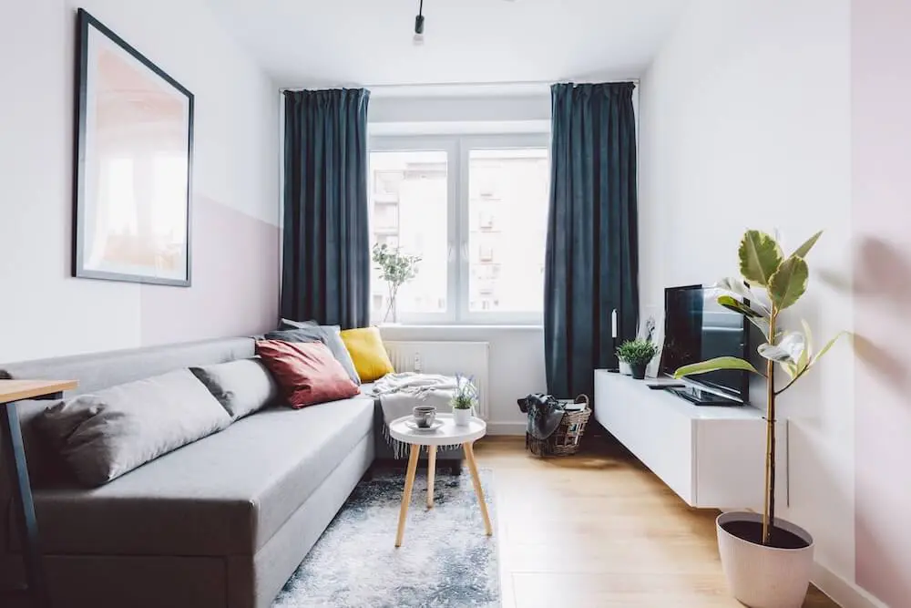
Tried-and-True Light-Reflecting Colours
When you want to make a small room feel bigger and brighter, choosing a paint colour with strong light-reflecting qualities is key. Certain shades naturally bounce more light around, helping to open up the space visually, especially in rooms with limited natural light.
Below are some proven colour families that work well in small, enclosed, or shadowed rooms:
Soft Whites
These are classic go-tos for brightening any room, but not all whites are stark or clinical. Look for warmer or slightly creamy undertones that keep the space feeling welcoming.
- Examples: Cloud White, Simply White, Swiss Coffee
- Best for: Hallways, laundry rooms, or anywhere you want a crisp, clean base
Pale Neutrals
Beige, greige, and light taupe tones offer a warm brightness that doesn’t feel too stark. They reflect light well while adding subtle depth and comfort.
- Examples: Pale Oak, Classic Grey, Edgecomb Grey
- Best for: Bedrooms, small living areas, or transitional spaces
Cool Pastels
Cool tones like pale blue, mint, and soft lavender give a breezy, fresh look — perfect for rooms where you want to feel a little more spacious and calm.
- Examples: Sea Salt, Misty Blue, Hint of Violet
- Best for: Bathrooms, nurseries, or small offices
Each of these colour types works with a different kind of light. For example, north-facing rooms may benefit from warmer neutrals, while south-facing spaces can handle cooler tones without feeling icy.
If you’re not sure which direction your room faces or how light changes throughout the day, a paint consultation can help narrow down the best options for your exact conditions.
Don’t Overlook Undertones and Finishes
Even the brightest colour can fall flat if its undertone clashes with your lighting, or if the finish absorbs more light than it reflects. That’s why getting the technical details right matters just as much as choosing a pretty shade.
Let’s break down two important factors that influence how bright a paint colour actually looks once it’s on the wall:
1. Undertones
Undertones are the subtle tints beneath the main colour. They can be warm (yellow, red, pink) or cool (blue, green, violet). In small rooms, undertones can shift depending on the light source, which is why some whites look blue in one space and creamy in another.
- In north-facing rooms with cooler natural light, choose warmer undertones to avoid a cold feel.
- In south-facing or high-light rooms, cooler undertones help balance brightness and keep things crisp.
Always sample your colours in the room before painting the whole space. A warm beige in the store can read orange or peach once it’s up, and that can throw off the whole vibe.
2. Finish (Sheen)
The finish of your paint affects how much light it reflects. In smaller spaces, a slightly higher sheen can subtly boost brightness.
- Matte or flat finishes have low reflectivity and can make small rooms feel more enclosed.
- Eggshell or satin finishes reflect more light and are easier to clean — great for high-traffic areas or bathrooms.
- Semi-gloss can be used selectively (like on trim or cabinetry) to create contrast and definition without overwhelming the space.
And don’t forget the ceiling and trim — using a lighter, brighter white on the ceiling can make it feel higher, while glossy white trim helps frame the walls and make the space pop.
Colour Tips by Room Type
Not all small rooms serve the same purpose, and your colour choice should reflect how you want the space to feel and function. The right hue can energise a work area, soften a bedroom, or visually stretch a narrow hallway.
Here’s how to choose the best brightening interior paint colours by room type:
Bathrooms
Small bathrooms often lack natural light, making them feel even more compact. Choose light, cool tones to reflect light and keep the space feeling clean and fresh.
- Try: Crisp whites, pale blue, soft grey, or mint green
- Pro tip: Use a satin finish to resist moisture and add subtle shine
Bedrooms
In small bedrooms, you want a sense of calm and space without the walls feeling stark. Soft warm neutrals or muted pastels strike that balance.
- Try: Pale greige, blush, muted lavender, or warm beige
- Pro tip: Pair with white ceilings and minimal contrast to maintain flow
Home Offices
Home offices in tight quarters need to feel open but not sterile. Cool-toned neutrals and soft greys help reflect light while supporting focus.
- Try: Light taupe, pale grey-blue, or gentle sage
- Pro tip: Avoid overly saturated colours that can overwhelm the space over time
Hallways and Entryways
These areas are often narrow, dim, and transitional, which makes them perfect for light-enhancing neutrals.
- Try: Soft white, cream, or pastel greige.
- Pro tip: Use the same colour on walls and trim to visually widen the space
Matching colour choice to function helps you get more than just brightness — it helps the room actually feel better to spend time in.
Colour That Changes the Feel of a Room
Brightening a small room doesn’t require a renovation — it just takes the right paint colour, applied with intention. When you understand how light, undertones, and finish work together, you can completely shift how a space looks and feels, even without changing the layout.
To recap:
- Choose light, reflective colours like soft whites, pale neutrals, or cool pastels
- Pay attention to undertones to match your room’s lighting and mood
- Select finishes that bounce light without adding glare
- Tailor your colour choices to the room’s function for both comfort and style
If you’re standing in a small room wondering why it feels dim or cramped, your paint might be doing more harm than good. A thoughtful colour change can open things up — and make your space feel more like home.Need help picking the perfect shade for a small space? A colour consultation can help take the guesswork out of your decision and make sure your room works with the light it has, not against it.
